_ projects
/
Taxact
Mobile Tax Filing
A simpler, more approachable experience for modern tax filers.
Overview
Younger filers made up a large portion of TaxAct’s mobile app audience, but their mobile experience was outdated and complex, even for seasoned-filers.
I collaborated with one other UX designer to redesign the mobile app, creating a more approachable filing experience that felt natural on mobile devices.
Problem
Tax filing is already a confusing process, but the mobile experience added unnecessary friction for users.
The app relied on dense forms, unfamiliar terminology, and limited guidance, leaving users unsure if they were completing each step correctly.
Users
TaxAct’s mobile app primarily served younger filers who were looking for a faster, simpler way to complete their taxes.
Many users were filing on their own for the first time and needed clear guidance, reassurance, and a better understanding of what each step required.
Goal
Redesign the mobile experience to reduce complexity and help users feel confident throughout the filing process.
Research
To better understand where users struggled, we conducted user interviews, surveys and competitive analysis’s to identify pain points throughout the filing process.
Findings
Many users worried they were making mistakes and wanted reassurance throughout the process.
Legal tax jargon made it difficult for users to understand what information was needed and why.
Rather than navigating long forms, 70% of users preferred a simple, step-by-step experience.
Users expected a clean, familiar mobile experience with clear content and guidance.
“I constantly feel like I’m doing something wrong.”
“I want to see deductions without legal jargon.”
Design Prep
We came up with some design principals to guide the redesign
Confidence - Reassure users that they are completing tasks correctly
Simplicity - Reduce cognitive load by breaking the process into clear, focused steps
Education - Explain what’s happening and why
Relatability - Use familiar patterns and language to make the experience feel approachable
Ideation
We explored different ways to make tax filing feel simpler and more approachable.
Some initial directions included:
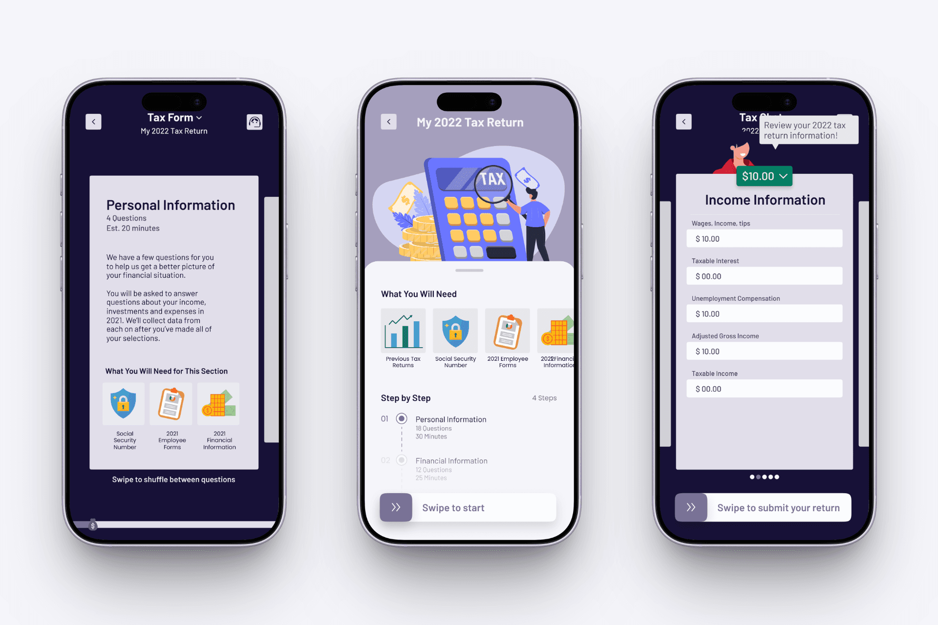
Gamifying the experience by breaking the process into smaller, interactive steps.
Messaging-style experience that guided users through their return one step at a time.
After reviewing both approaches with stakeholders, we moved forward with the messaging experience because it aligned with the companies brand direction and provided a stronger foundation for future features.
Feedback and Iteration
The initial messaging concept helped simplify the filing process, but it still felt too transactional and lacked the personality users expected from a modern mobile experience.
To make the experience feel more approachable, we explored how people communicate in everyday digital products and refined:
Conversational tone and language
Use of emojis and visual feedback
Timing and pacing of interactions
These changes helped transform the experience from a simple question-and-answer flow into a more supportive and reassuring filing journey.
Design
After 5 months of research, design, iteration and testing, we ended up with...
Simplified Starting Point
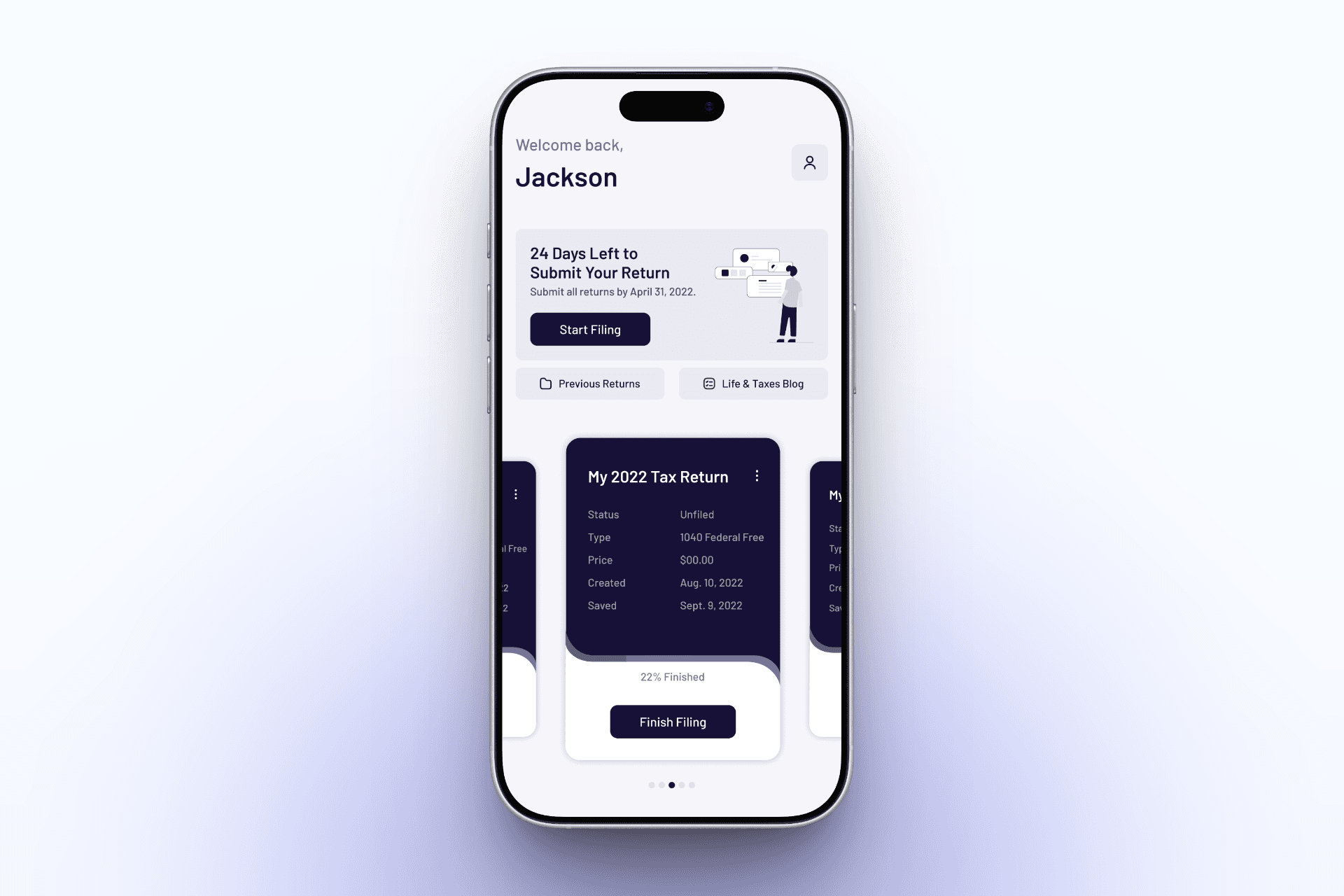
We redesigned the home screen to help users understand where to begin and what actions mattered most.
Surfaces key filing actions and next steps
Highlights important deadlines and reminders
Provides quick access to helpful resources
Guided Chat Experience
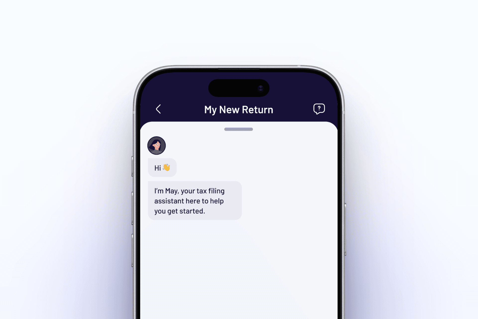
We introduced a conversational interface with the companies assistant that guides users through their tax return one step at a time.
Breaks complex forms into smaller questions
Keeps users focused on one task at a time
Reduces uncertainty throughout the filing process
Contextual Education
To help users understand unfamiliar tax concepts, we added explanations directly within the flow with a “What’s this?” button.
Provides quick answers when users need them without adding friction
Explains why information is required
Keeps users moving without leaving the experience
Tone and Personality Design
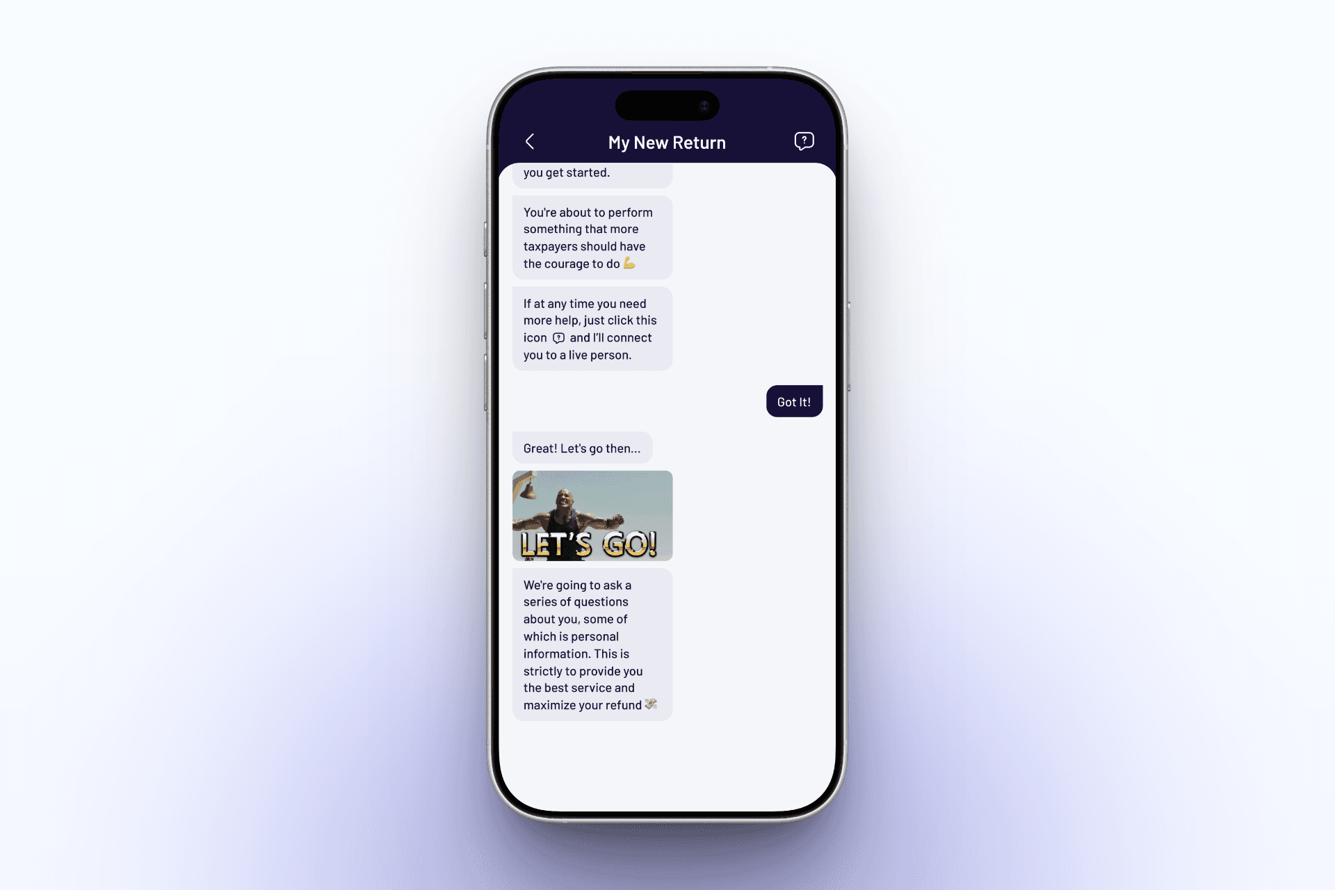
We incorporated a conversational tone, along with subtle use of emojis and GIFs, to make the experience feel more approachable and human.
Uses friendly language and supportive feedback
Incorporates familiar mobile patterns
Builds confidence while maintaining trust
Results & Impact
Contributed to an 18% increase in company revenue within one year
Improved usability and accessibility for first-time filers
Reduced user anxiety and increased completion confidence
Takeaways
What I Learned from TaxAct
Complex products require deeper understanding - Designing for tax filing required learning a complex domain while balancing simplicity, accuracy, and compliance. Understanding the details helped create an experience that felt clear without oversimplifying important information.
Clarity starts with structure - Breaking down a complicated filing process reinforced the importance of strong information architecture and clear user flows. The right structure made the experience easier for users to understand and easier for teams to build.
Tone shapes user confidence - Small changes in language and interaction patterns can have a big impact on how users feel. Finding the right balance between approachable and trustworthy helped make a stressful process feel more manageable.
Project details
Client
Taxact
Timeline
4 months
Industry
Finance
Deliverable
iOS App, Android App
Team Members
Kerry Esmon
Comment

Madison
Some information in this case study has been anonymized. This case study reflects my perspective and not necessarily those of the client.