_ projects
/
Taxact
Mobile Tax Filing Experience
A redesigned mobile experience for filing taxes quickly and confidently.
Overview
A well-known tax software company with over 20k customers and 25+ years in business set out to expand into a new audience: first-time filers. While their existing product served experienced users well, it lacked the clarity and guidance needed for younger, less experienced users.
I led UX for a new cross-platform mobile app, owning research, user flows, and end-to-end design. I collaborated closely with engineers, PMs, and stakeholders to take the product from concept to launch.
Problem
First-time filers feel overwhelmed and unsure when filing taxes, leading to confusion, errors, and low confidence.
Users
Young adults (Gen Z), typically filing taxes for the first time, who:
Have little to no understanding of tax concepts
Primarily rely on their mobile device
Need reassurance they are “doing it right”
Goal
Create a simple tax filing experience that reduces confusion while boosting user confidence.
Research
Methods
Surveys
User interviews
Competitive analysis
Behavioral research on Gen Z digital habits
Key Insights
Users feel they are doing something wrong during filing
Legal/tax jargon is a major barrier
Users want something quick, simple, and guided
90% value visual simplicity and informative content
70% value step-by-step guidance
“I constantly feel like I’m doing something wrong.”
“I want to see deductions without legal jargon.”
Design Principals
Confidence - Reinforce that users are completing tasks correctly
Simplicity - Reduce cognitive load through simple, focused steps
Education - Explain what’s happening and why
Relatability - Use familiar patterns to make the experience feel approachable
Ideation
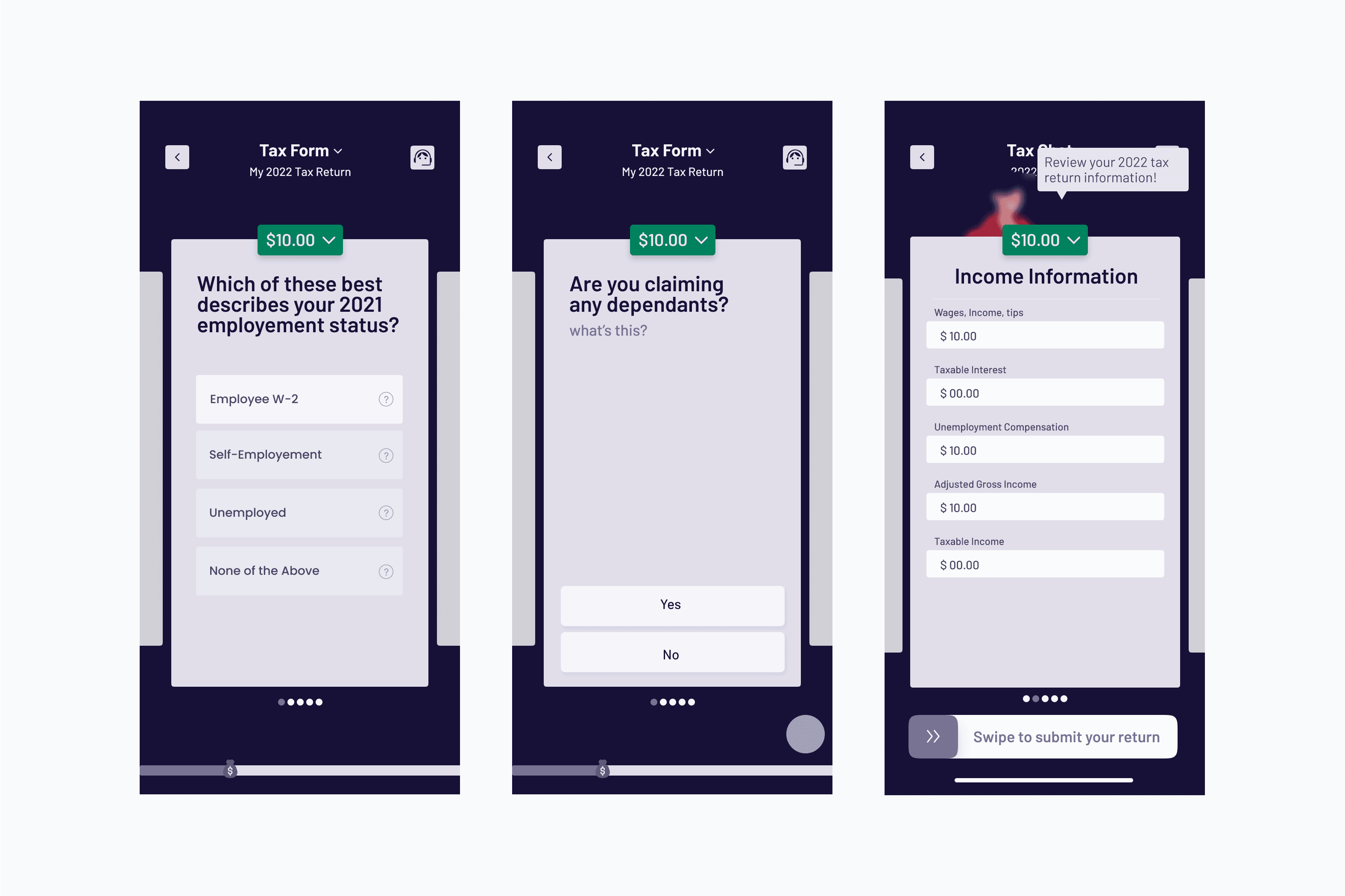
We explored multiple directions to make taxes more approachable:
Option 1: Gamification - Break the process into interactive steps to increase engagement.
Option 2: Messaging - Guide users through filing via a message-style interface.
After stakeholder review, we moved forward with the messaging approach as it better supported long-term scalability and aligned with brand direction.
Feedback and Iteration
Initial chatbot concepts improved simplicity but lacked engagement and personality.
To better connect with Gen Z users, we:
Researched cultural patterns (messaging apps, tone, content styles)
Identified emojis and GIFs as familiar and engaging elements
Iterated on tone, pacing, and visual feedback
This shifted the experience from purely functional to supportive and relatable.
Solution
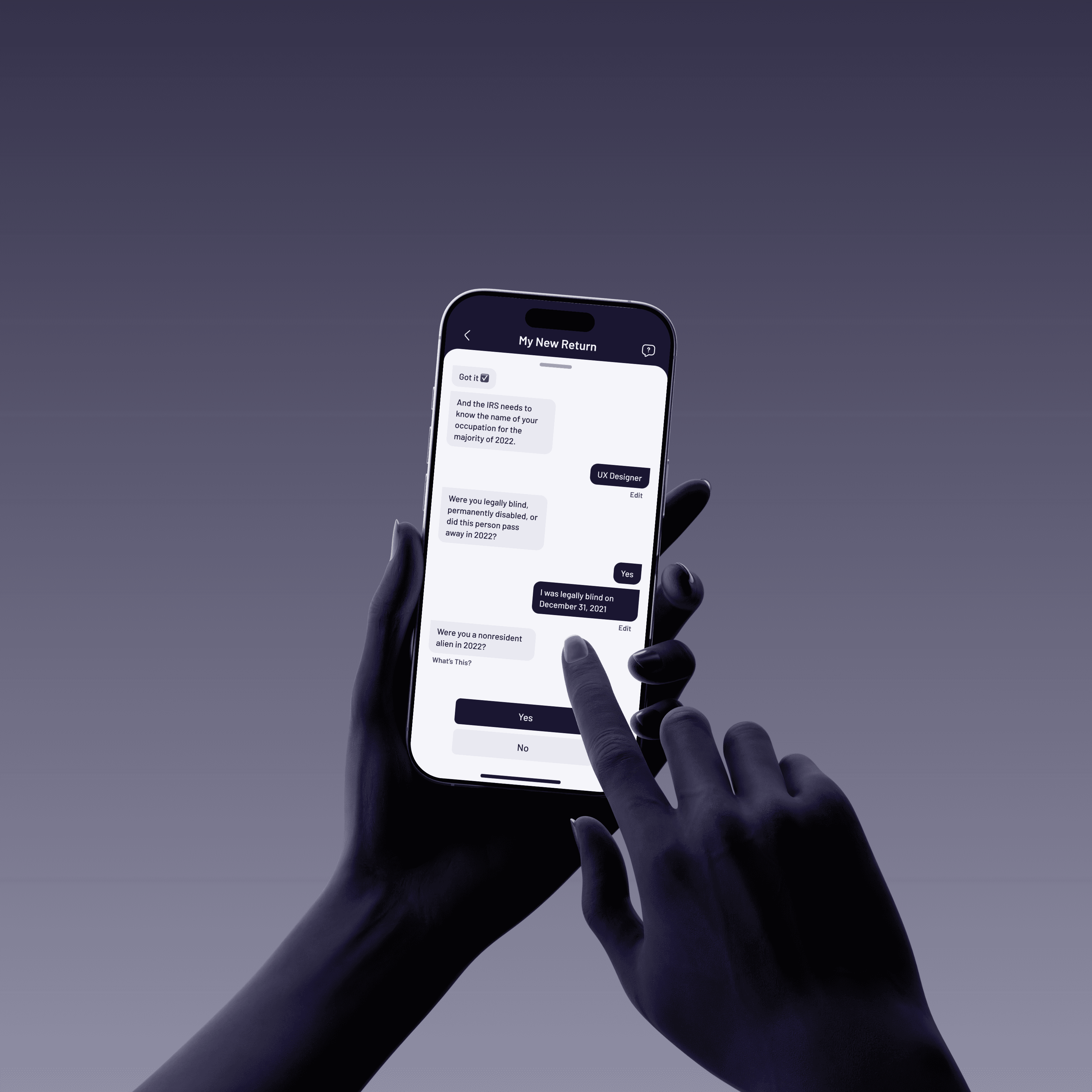
Simplified Entry Point
We redesigned the home screen to prioritize the most relevant actions and information, reducing cognitive load and helping users get started quickly.
Surfaces key actions and next steps
Highlights deadlines and reminders
Provides quick access to helpful resources
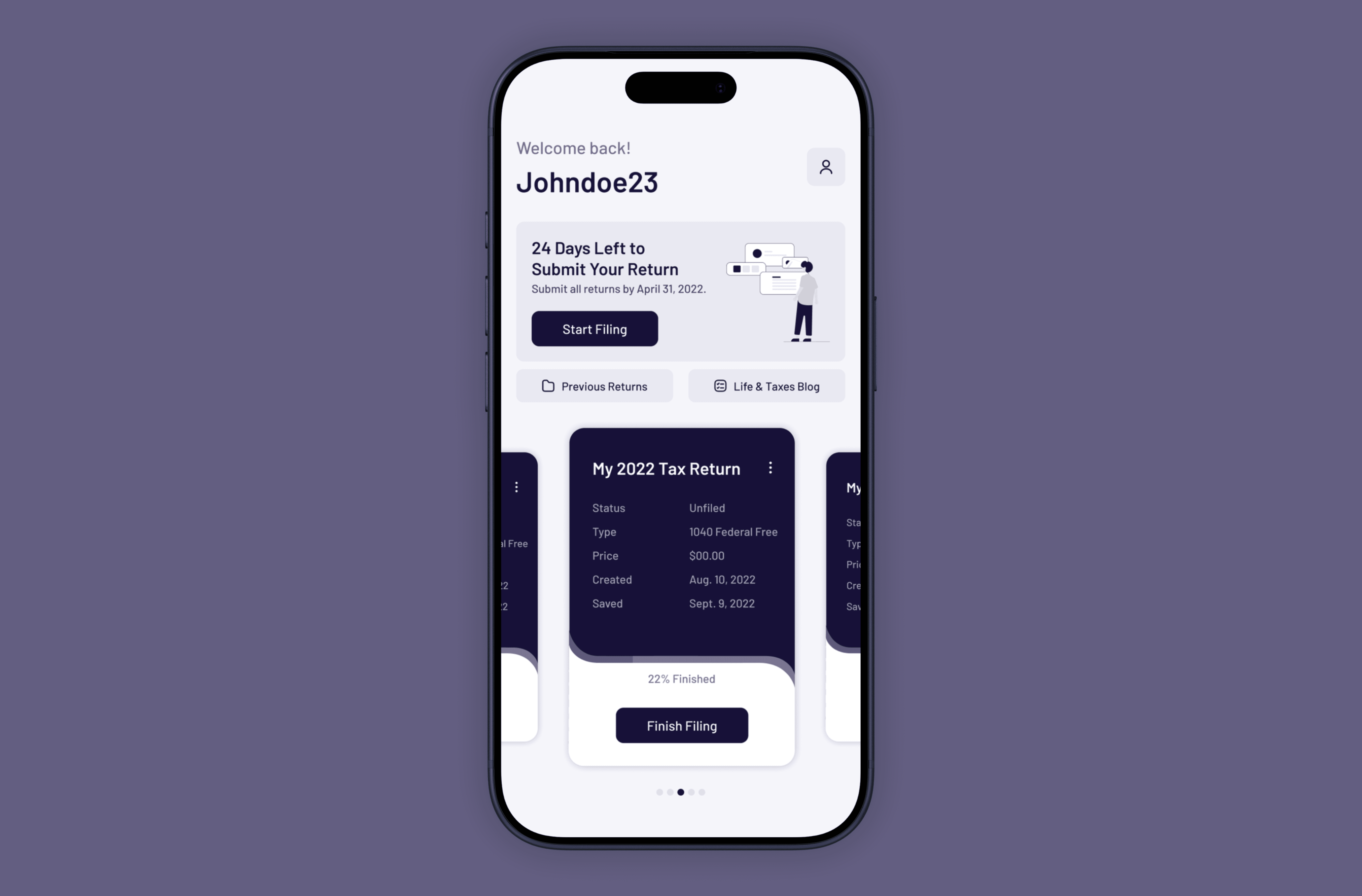
Guided Chat Experience
We introduced a familiar messaging interface where users are guided through their tax return step-by-step by a branded assistant.
Breaks down complex forms into manageable questions
Reduces fear of making mistakes
Keeps users focused on one task at a time
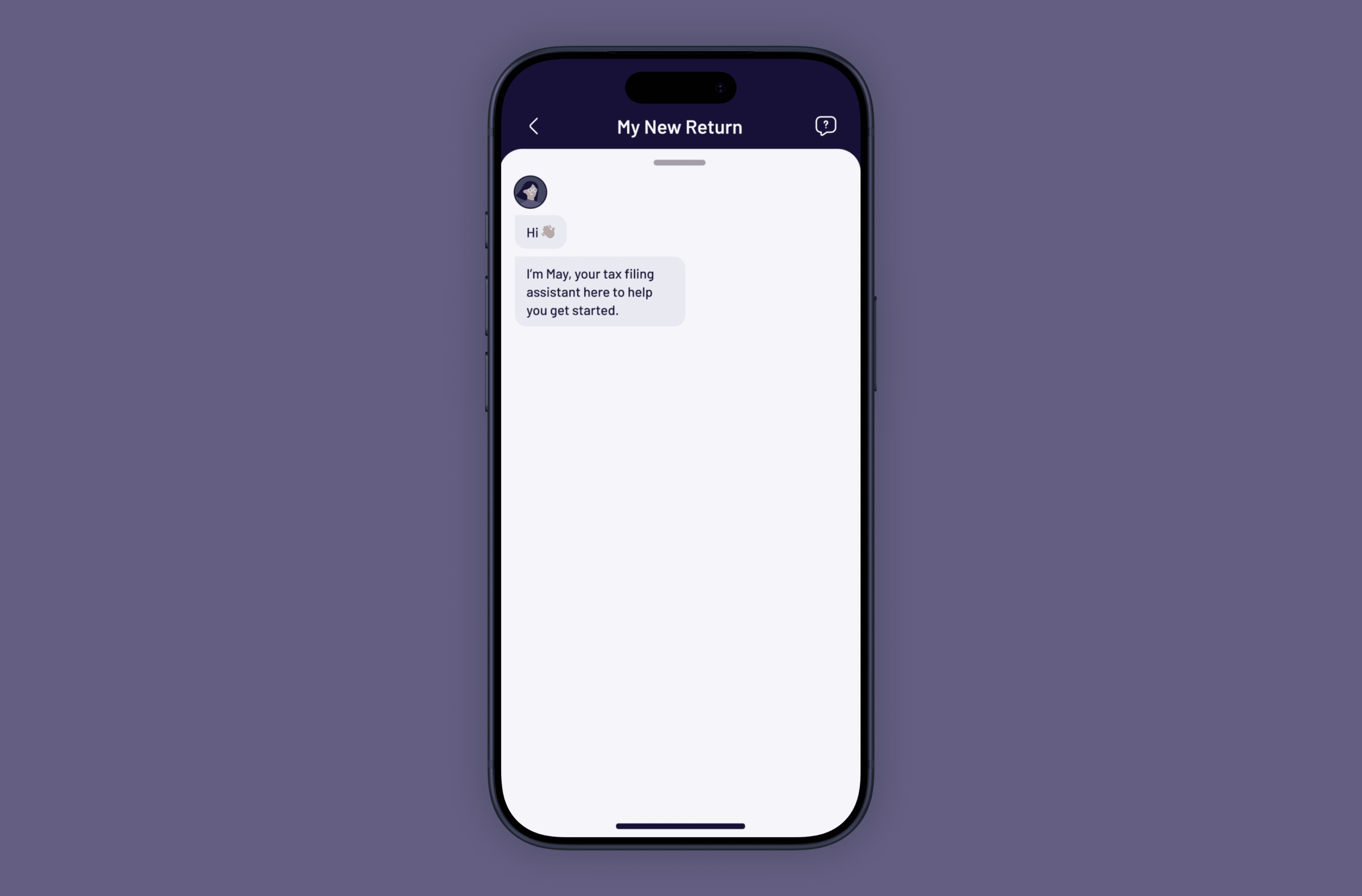
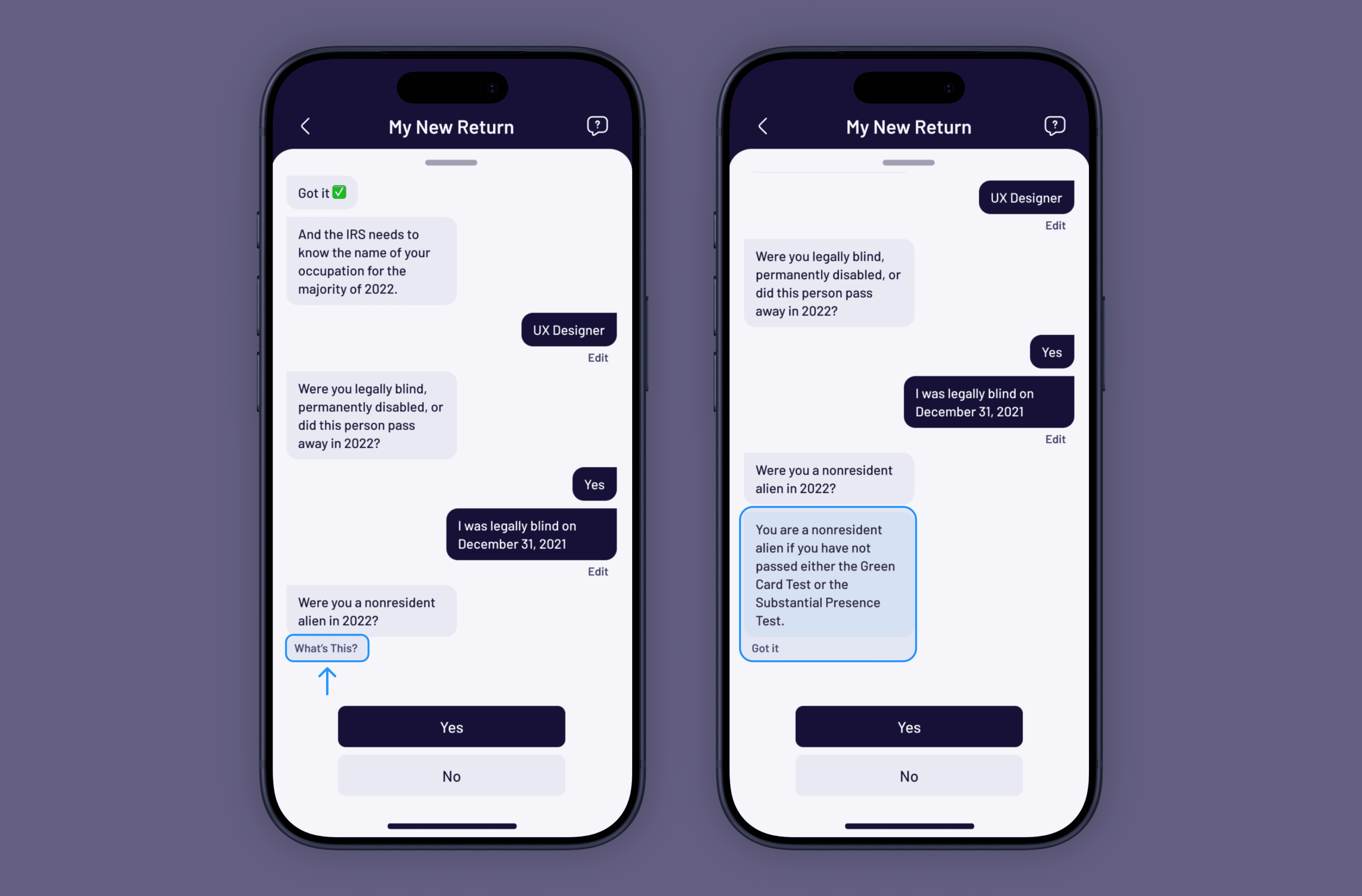
On-Demand Education
A “What’s this?” button provides quick contextual explanations under each question.
Accessible when needed without adding friction to the flow
Explains why information is needed
Keeps users in context
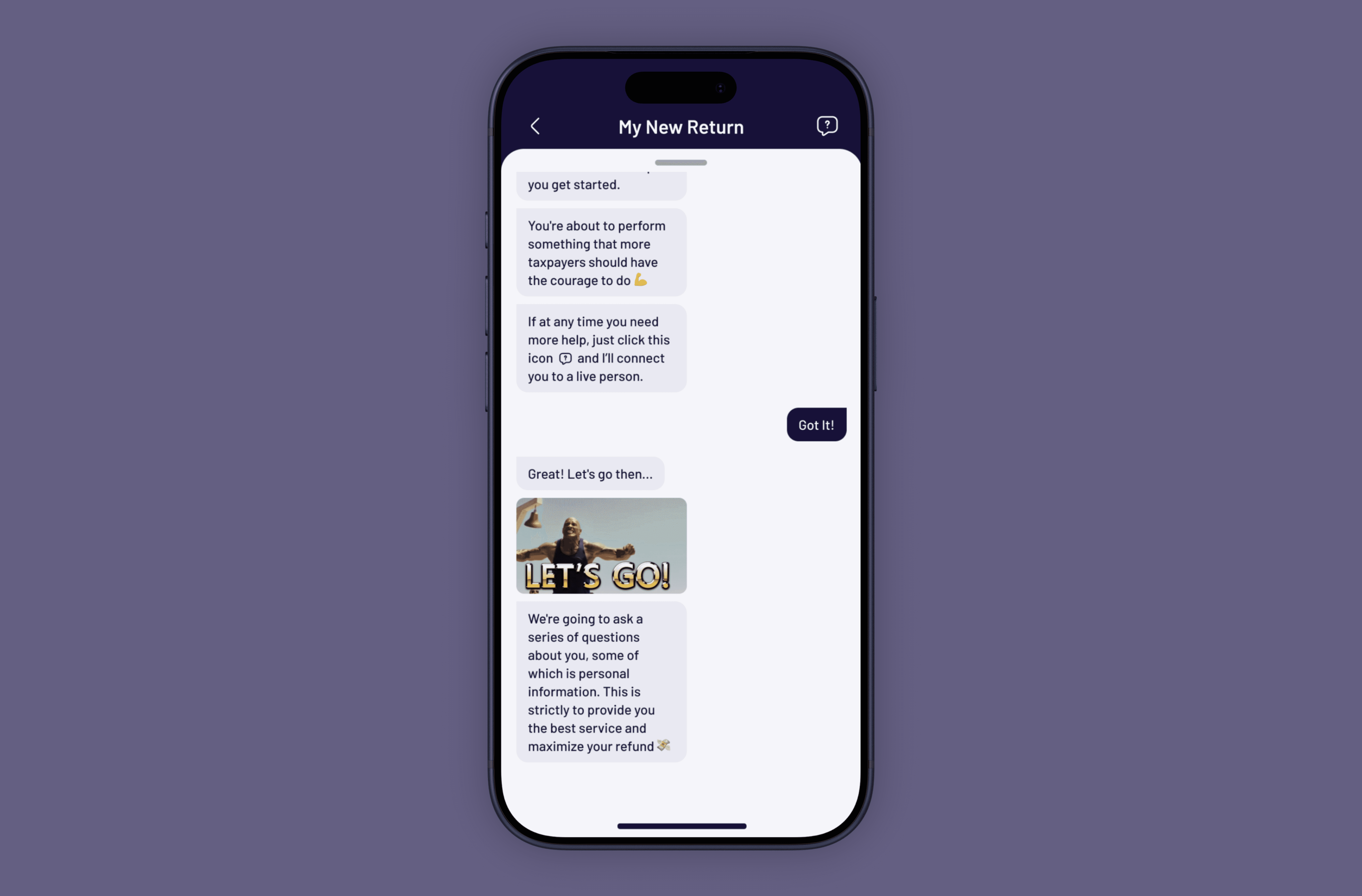
Tone and Personality Design
We incorporated a conversational tone, along with subtle use of emojis and GIFs, to make the experience feel more approachable and human.
Reinforces encouragement throughout the process
Reduces perceived complexity
Increases engagement while maintaining trust
Results & Impact
Contributed to an 18% increase in company revenue within one year
Improved usability and accessibility for first-time filers
Reduced user anxiety and increased completion confidence
What I Learned
Design requires deep domain understanding - Understanding complex tax concepts and legal constraints was required to ensure the experience was both clear and compliant.
Information architecture is critical in complex systems - Defining clear flows and structure helped us create a simplified flow while also aligning the team on how everything worked together. It became a key tool for simplifying complexity at both the product and system level.
Tone is a product decision, not just a design choice - Small shifts in voice and interaction patterns impact user confidence. Using the proper tone required balancing approachability with clarity and legal accuracy.
Project details
Client
Taxact
Date
2022
Industry
Finance
Deliverable
iOS App, Android App
Team Members
Kerry Esmon
Research
User Flows
User Testing
Design System
Comment

Madison
In compliance with NDAs, identifiable information has been anonymized. This case study reflects my perspective and not necessarily the client's.